Animate Text with SVG
You've probably seen, on a polished website, text that writes itself, stroke after stroke, as if drawn by hand right before your eyes. It's elegant, it catches the eye, and the best part: it can be done natively, with no library, thanks to a simple trick on SVG paths. This post aims to explain, in the simplest way possible, how to create this effect, from the basic concept all the way to a clean version with React and GSAP.
That's the idea: text that draws itself before your eyes, with precise control over every stroke and letter. Let's first see why SVG is essential for this effect, then how to animate it step by step.
Why Use SVGs Instead of Classic CSS/HTML?
Classic CSS and HTML tags (<h1>, <p>, etc.) cannot create this progressive drawing effect for several reasons:
HTML Text Limitations
-
HTML text is rendered as glyphs: The browser displays letters as pre-rendered shapes (font glyphs), not as animatable paths. Once rendered, text becomes a static image.
-
No access to drawing coordinates: We cannot know the length of a letter's "stroke" to animate it. The browser doesn't give us access to these kinds of tools.
-
CSS limitations: The
stroke-dasharrayandstroke-dashoffsetproperties only work on SVG<path>elements, not on HTML text. These properties are essential for creating the progressive drawing effect.
Advantages of SVG Paths
SVG paths solve all these problems by representing text as mathematical coordinates (the d attribute), which allows us to:
- Calculate total length: With
getTotalLength(), we get the exact path length in pixels - Animate progressively: We can animate the stroke along the path precisely
- Control every point: Every point of the drawing is accessible and animatable
- Create complex effects: Ability to animate multiple paths simultaneously or sequentially
Key attributes for animation:
-
stroke-dasharray: Defines the dash pattern of the stroke. For example,stroke-dasharray="10 5"creates 10px dashes followed by 5px spaces. By using the total path length as the value, we create a single long dash that covers the entire path. -
stroke-dashoffset: Moves the starting point of the dash pattern along the path. A positive value shifts the pattern toward the end of the path, a negative value toward the beginning. By animating this value from the path length to 0, we create the progressive drawing effect.
For more details, see: stroke-dasharray and stroke-dashoffset on MDN.
But How Do You Convert Text to SVG?
The problem we encounter most quickly when wanting to create this kind of animation is converting text to SVG. For this, there is a wonderful open source and free tool created by danmarshall that allows converting text to SVG: Google Font to SVG Path Converter:
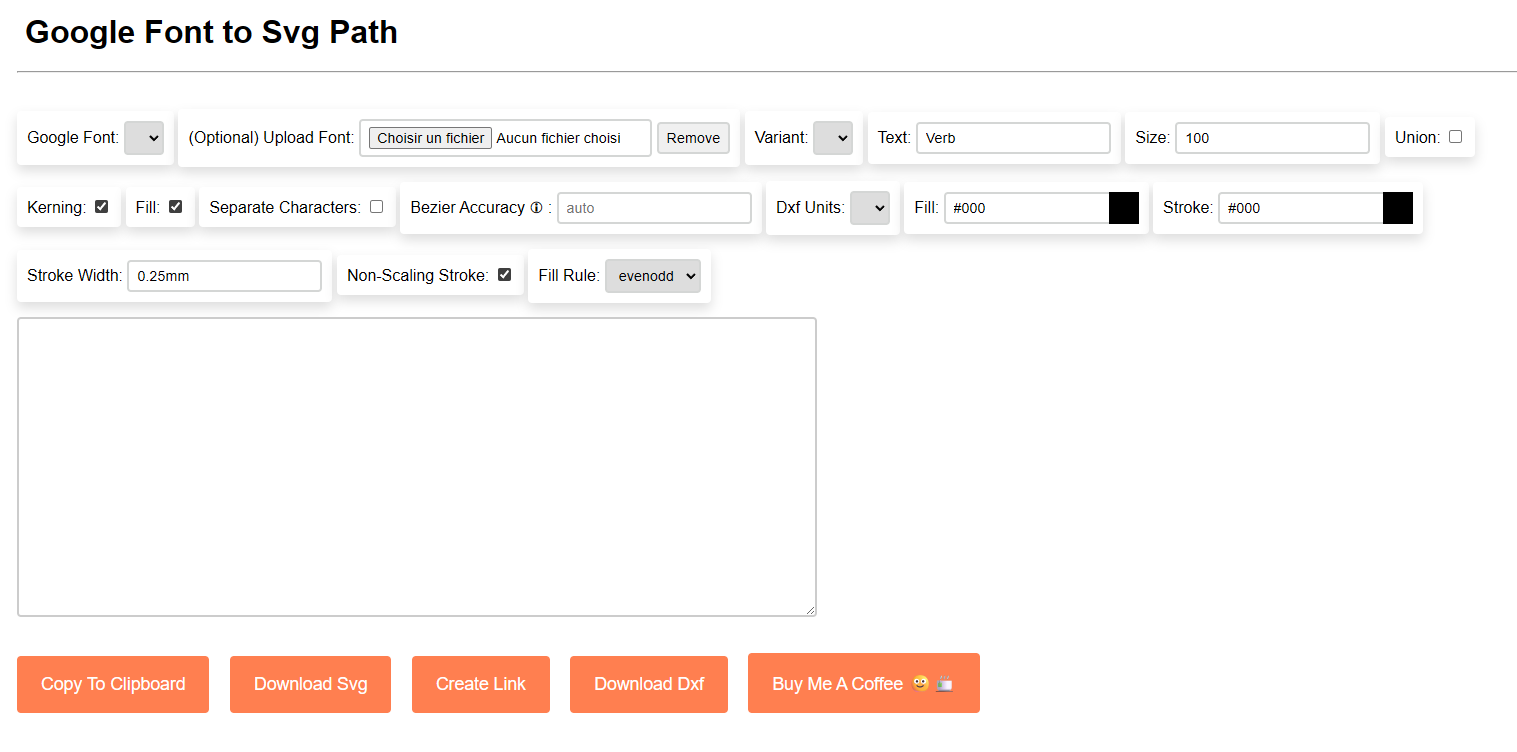
This tool allows us to:
- Select a Google Font or import one and enter our text
- See the rendering of our text in SVG
- View and copy the generated SVG code
Once you have your SVG code, you can move on to implementing the animation.
Simple Implementation Example
Here's a minimalist example to understand the basic concepts:
HTML:
<svg width="62" height="71.1" viewBox="0 0 62 71.1" xmlns="http://www.w3.org/2000/svg">
    <path
        class="path"
        d="M 36.4 71.1 L 25.7 71.1 L 0 3.6 L 9.3 0 L 31.3 60.7 L 53.4 0.3 L 62 3.6 L 36.4 71.1 Z"
    />
</svg>
.path {
stroke: #000;
stroke-width: 0.25mm;
fill: none;
}I've retrieved the SVG code generated by the conversion tool and added a class to the <path> tag to access it more easily with JavaScript and apply CSS styles by giving it default values.
JavaScript:
const path = document.querySelector('.path');
const length = path.getTotalLength();
path.style.strokeDasharray = length;
path.style.strokeDashoffset = length; // Starts hidden

const duration = 2000; // 2 seconds
const startTime = Date.now();

function animate() {
    const elapsed = Date.now() - startTime;
    const progress = Math.min(elapsed / duration, 1);

    path.style.strokeDashoffset = length * (1 - progress); // From length to 0

    if (progress < 1) {
        requestAnimationFrame(animate);
    }
}

animate();
Key Points to Understand
-
getTotalLength(): Gets the total path length in pixels. -
strokeDasharray = length: Creates a dash the same length as the entire path. -
strokeDashoffset: We animate this value fromlength(path hidden) to0(path visible). By progressively decreasing it, the dash "slides" along the path, gradually revealing the drawing. -
requestAnimationFrame: Synchronizes the animation with the browser (~60fps) for smooth animation.
Now that you understand the basic principle, you can move on to the complete implementation with React and GSAP.
Complete Solution with React and GSAP
It's time to move on to the complete implementation with React and GSAP for our animation :) !
React Implementation
"use client";

import { useGSAP } from "@gsap/react";
import gsap from "gsap";
import { useRef } from "react";

export default function AnimatedText({ height = 120 }: { height?: number }) {
  const pathRefs = useRef<(SVGPathElement | null)[]>([]);

  useGSAP(() => {
    pathRefs.current.forEach((path) => {
      if (!path) return;

      const length = path.getTotalLength();
      path.style.strokeDasharray = length.toString();
      path.style.strokeDashoffset = length.toString();

      // Draw the stroke
      gsap.to(path, {
        strokeDashoffset: 0,
        duration: 4,
        ease: "power2.in",
      });

      // Fill after the stroke is complete
      gsap.to(path, {
        delay: 2,
        fill: "#FFFCF2",
        duration: 2,
        ease: "power2.in",
      });
    });
  }, []);

  return (
    <svg width="auto" height={height} viewBox="0 0 248.295 172.203">
      <path
        ref={(el) => {
          pathRefs.current[0] = el;
        }}
        fill="none"
        stroke="#FFFCF2"
        d="M 151.601 0 L 151.801 0.2..."
      />
    </svg>
  );
}
Advantages of this Approach
useGSAP: React hook that automatically handles animation cleanup when the component unmounts- GSAP: Powerful animation library with natural easing (
power2.infor smooth deceleration) - Two-step animation: First the stroke, then the fill for a complete effect.
Animating Multiple Paths
For multiple words or letters, animate them all at once or in a cascade. The only difference is a delay computed from the index:
// All at once
pathRefs.current.forEach((path) => {
  gsap.to(path, {
    strokeDashoffset: 0,
    duration: 2,
    ease: "power2.in",
  });
});

// One after another (cascade effect)
pathRefs.current.forEach((path, index) => {
  gsap.to(path, {
    strokeDashoffset: 0,
    duration: 2,
    delay: index * 0.4, // each path starts 0.4s after the previous one
    ease: "power2.in",
  });
});
That's it, and it's intentionally short: the key takeaway is that you can create this kind of animation natively, with a single SVG trick and a few lines of JavaScript. The rest is just a matter of imagination, so it's your turn to play :)